Case study of the All Saints store
- Jan 8, 2018
- 5 min read
The colour trends from forecasters for spring/summer 2017 were Eye-popping fuchsia, Zingy yellow and Tropical green that were shown on the catwalk in London and New York fashion week, where Balenciaga’s bright pink collection mixed with Thornton Bregazzi pastel coloured dresses. By looking at Vogue and other leading magazines we can see what big colour trends were on the catwalk for the season. But to get a more accurate colour palette for spring/summer 2017 we would have to look at colour forecasters like Pantone or WGSN to see what they predicted for the season.

pantone said that s/s 17 would be "A Mixture of Vitality, Relaxation and the Great Outdoors From colors that are bright and vivid to those that convey a sense of earthiness, our top 10 colors for spring 2017 are reminiscent of the hues that surround us in nature. In conjunction with New York Fashion Week, the PANTONE Fashion Color Report provides a comprehensive overview of fashion designers’ use of color in their spring 2017 collections."[i]
With the Pantone predictions for s/s 2017 we can see that it was a bright and colourful season with many interesting styles, this being said I will be looking at All Saints store and be comparing its colour palette to the colour forecast from Pantone and WGSN to see if and how they follow the trends and how this affects their store.
WGSN forecast had four different colour palettes for S/S17 Digital Wave, Edgelands, Encounter Culture and Pause.

Digital Wave
Colour will be cleaned up, infused with the look and feel of the digital age. Classic 1980s tones will return, and black plum will emerge as a key tone. Electric magenta, hot pink and machine red will get things off to a bright start this season, with jellybean green and headlight yellow injecting a shot of refreshing colour. [ii]
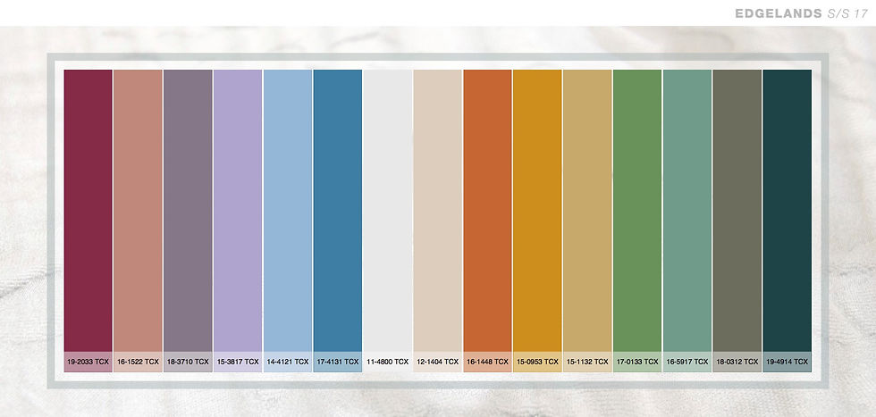
Edgelands
Colour will have a homespun feel. Chintz pink is cosy and comfortable, clarity white will bring a reminder of the home into the palette, while the pretty pale purples will stir memories of sweet-smelling bluebells displayed in jars on the kitchen table at spring. Through colour, Edgelands will capture the warmth of the home and the smell, transitional changes that occur from season to season. The 1970s-style tones of avocado green and golden amber will bring a nostalgic touch of pastoral romance to the palettes.[iii]

Encounter culture
Encounter Culture will be the high-summer colour vehicle for 2017. It will offer a ray of sunshine, as the palette sweeps from the sea to the edge of the jungle. Cocoa bean, coconut and sand will emerge as key neutrals, while mango, ackee, parrot green and dragon-fruit pink will bring bright, tropical bursts of true Caribbean culture [iv]

Pause
Pause will offer a mysterious palette. Clod white, blue and grey will provide a pure, calming effect, as will the warmer addition of stone blue, apricot and deep coral. There is a freshness for summer, though this is countered by the deeper sides of the palette with ebony and espresso and the richness of mangosteen. Muted gold and champagne will enhance this feeling of luxury, while horizon yellow will bring a surprising twist to pause’s more serious side, lightly lifting the palette. [v]
With this, you can see that they are some recurring colours through all the forecast colours palettes from Pantone and WGSN. Now that we have looked at both colour palettes we can compare them to All Saints and the colours they had in their store in s/s 17 and see how they interpreted the colour trend for the season
What was in All Saints S/S 17?
How much did All Saints collection follow the colour forecasting trends?
Let’s start by looking at All Saints and the style that they have made for themselves, by looking at seasons that have been you can start to see that the have a style / aesthetic that they and a colour palette that they use with only minor changes each season.


As you can see in 2016 All Saints had a earthy colour palette that they all so had before hand, this has translated in to their brand as their style


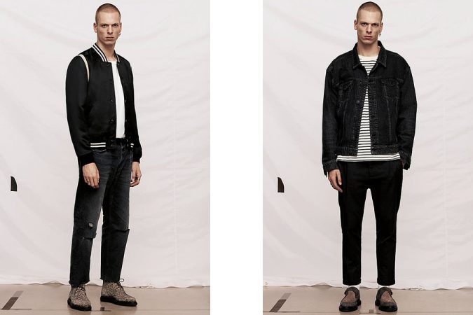
here with the menswear the went with dark earthy colours and a couple of bits with a bright red but not much more in the way of colour.
By look at All Saint's short film for spring 2017 (Far from here),[vi]
With this short film you see Maya Hawke going on a trip wearing All Saints clothing range, in this you can see the main colours All Saints has used in there collection. you can start to see the colour palette with the black, white, purple and burnt orange. Within the men’s fashion for All Saints you can see more of their colour palette with the brown, forest green, burnt red, grey and light pink as shown in the All Saints lookbook for 2017. If I compare the colour palettes of All Saints to the forecast from Pantone you can see that they are using three of the colour that were forecast these are Pantone's kale, pale dogwood and hazelnut.
But if you look at the WGSN forecast they seem to be going off the Encounter Culture colour palette as most of their colours come up in this forecast. But are they going with the forecast or Is it co-incidence that the colours match with the forecast by WGSN, this is hard to tell as you can not find out who has look at the WGSN forecasts or if they have used it. So, because the colours seem to be a close match it is better to say they are going with the prediction. This would say that All Saints look at the forecast and went for a dark earthy colour palette with a small splash of colour within their designs, but they did not go with the bold bright colour perditions that were forecast by Pantone. This is most likely because they wanted a colour palette that would go with their other collections and not make you think about buying a whole new wardrobe. This is because their stock is more made to last a long time and is not seasonal which make it, so their line will sell for a longer time. This making their company more sustainable and making it so you get better clothing for your money. So, was this the best choice for them with their range? By going with the WGSN prediction they are keeping to the colour palette everyone expects from them. In my opinion this is a good thing for them as if they were to go with something completely different they would be changing what their brand has formed as an identity.
If you look at other shops that are going with season to season colour trends this is a passing trend that the shops have to keep up with, but with All Saints they have focussed on one trend that works all year round and can work year to year with only a couple of changes to the colours. From looking at this we can see that All Saints make it so they can make better quality garments that will last for years, instead of keeping up with high street retailers that make the clothing to last for one season.
With this outlook on clothing it makes us want to buy clothing from there, as we know that it will last and with them slightly changing the colours this makes it so we don’t fill like going each season to buy a new outfit, instead we go there when we need new clothing and just to keep up with the latest colours trends.
[i] https://www.pantone.com/fashion-color-report-spring-2017
[ii] https://www.wgsn.com/en/products/fashion/
[iii] https://www.wgsn.com/en/products/fashion/
[iv] https://www.wgsn.com/en/products/fashion/
[v] https://www.wgsn.com/en/products/fashion/
[vi] https://vimeo.com/181304121
Comments